Capability 01
Task Statuses
Instantly see what’s done, in progress, or delayed.
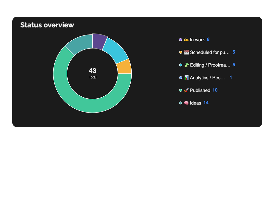
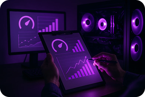
The dashboard displays completed, updated, and newly created tasks, team workload, statuses, and priorities — all in one convenient view.
Built for
By the numbers
15+
widget types
Easylim CRM
Real-time
updates without reload
customer data
1
screen = full project state
2025 survey
Clear visualization helps make quick, informed decisions.
Capability 01
Instantly see what’s done, in progress, or delayed.
Capability 02
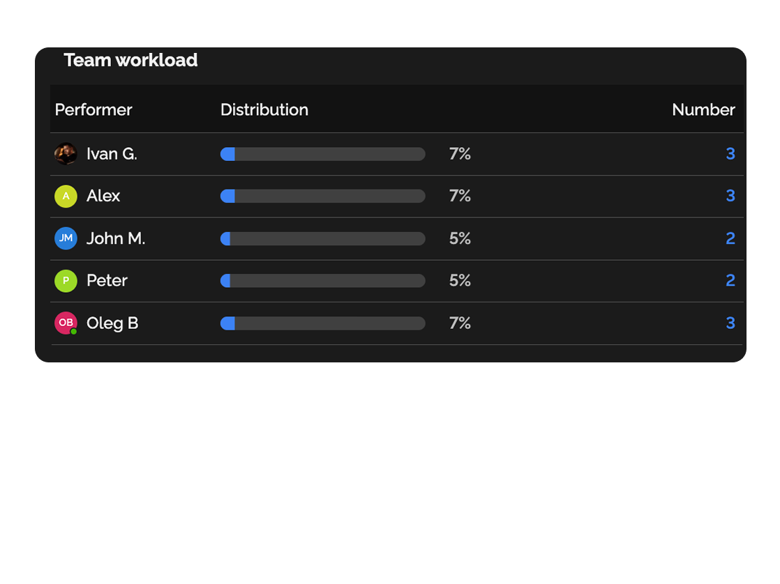
Track who’s overloaded and who can take on new tasks.
Capability 03
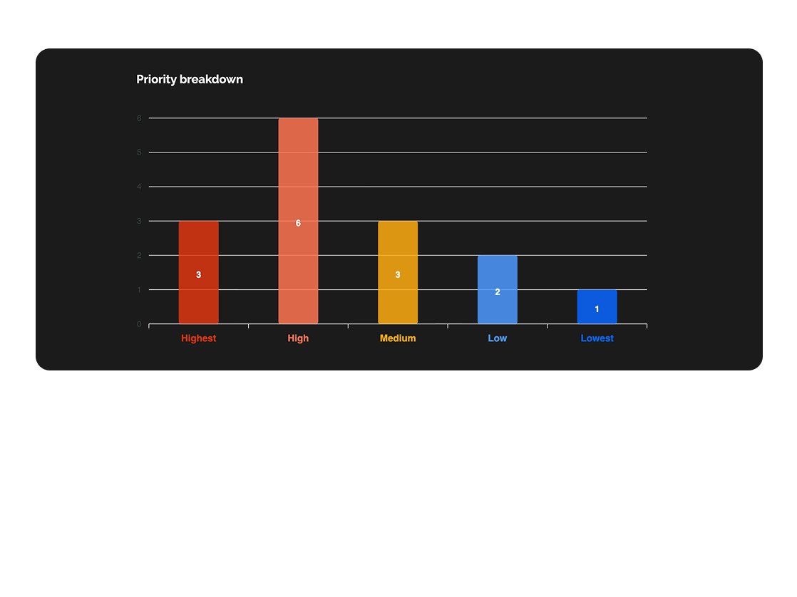
Understand which tasks require attention first.
Capability 04
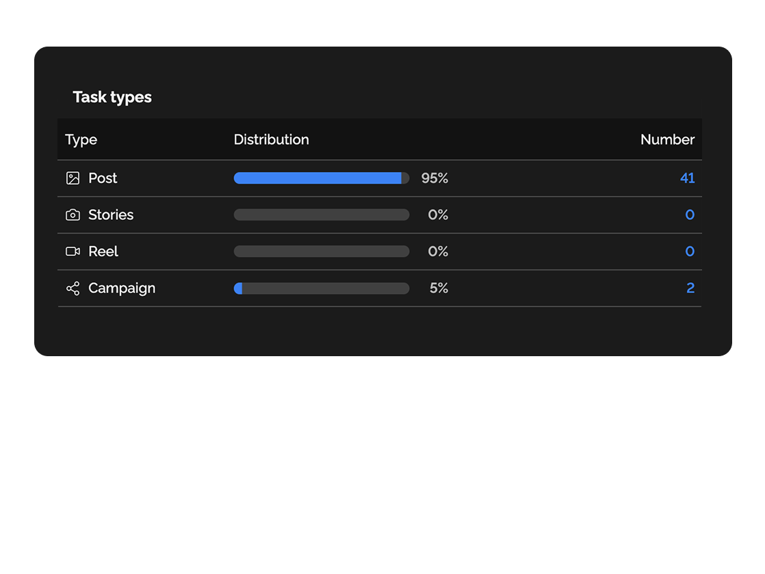
Analyze workflow performance by task type.
Easily track workloads and balance team resources.

See who’s completing tasks and how, to make data-driven decisions.
Deep dive
5 chapters
Dashboards die in two ways: they become a pretty picture nobody opens, or a wall of 30 widgets nobody can read. The difference between a working dashboard and a decorative one comes down to which questions it answers and whether anyone on the team actually looks at it on a Monday morning. Here's how to assemble a dashboard that saves you hours of syncs, plus when you genuinely don't need one and a single Kanban board would do the job.
Розділ
Kanban shows one project in detail: cards, columns, who's pulling what. A dashboard shows a cross-section across many projects at once: how many tasks closed this week across Acme and Stripe combined, who out of 12 people is overloaded, which deadlines are turning red.
That's the difference between a work surface and an instrument panel. A dashboard isn't for people pulling tasks — it's for people responsible for making sure tasks get pulled. Managers, leads, founders, heads of department: anyone who has 30 minutes in the morning to figure out where the fire is and go put it out.
That's why a dashboard isn't built from every metric in existence, but from 4-7 widgets that answer concrete questions: "what's at risk right now?", "who's overloaded?", "how many P0/P1 are in flight?". If a widget doesn't trigger an action, it's noise.
Розділ
Start from questions, not from widgets. Write down the 5 things you ask the team during your weekly sync: "anything at risk?", "who's burning out?", "how many P0 this week?", "how's release 4.2?", "did velocity drop?". Each question = one widget.
In Easylim, create a dashboard, click "+ Add widget" and pick a type: status counter (answers "how many at risk"), assignee breakdown ("who's overloaded"), priority filter ("P0/P1 count"), closed-per-week chart ("what's the pace").
Each widget can be narrowed with filters: a single project, only tasks tagged "release-4.2", only P0/P1, only overdue. This makes dashboards addressable — a "product team dashboard" and an "ops dashboard" look at the same data through different filters. Save dashboards by role, not as "one big board for everyone".
Розділ
Easylim ships over 15 widget types: counters (how many tasks in status X), breakdowns (by assignee, project, priority, tag), charts (closed vs created over days/weeks), lists (top-N overdue, oldest cards in Backlog), progress bars (sprint completion %).
A solid manager starter pack is 5 widgets: 1) Overdue P0/P1 — a live list. 2) Workload by assignee — a bar breakdown of active tasks. 3) Closed this week vs last — a pace chart. 4) At risk — tasks due in the next 3 days. 5) Oldest card in Backlog — a sanity check on whether you're saying no or quietly hoarding.
Real-time updates aren't marketing fluff here: when a card moves on a Kanban board, the dashboard reflects it without a refresh. Which means you can park it on a second monitor and forget about it — when "At risk" jumps from 2 to 5, you see it within seconds, not 18 hours later at the morning sync.
last 12 weeks
92+24% MoM
Розділ
Monday 09:30. Open the dashboard. The "At risk" widget shows 5 — one more than Friday. Click through to the list. Two were forgotten (assignee was on holiday yesterday), one is a real blocker. You DM 3 people in Slack instead of scheduling a 30-minute sync for 12.
Tuesday-Wednesday. The "workload" widget shows Alex on 14 active tasks and Alina on 4. Rebalance via teamboard, load levels to 9/9. Dashboard reflects it immediately: "At risk" drops from 5 to 3.
Thursday. The "Closed this week" chart shows pace 18% below last week. Drill in and notice: 3 tasks in Backlog have been waiting on the client for 2 days. One email later, they unblock by Friday.
Friday 16:00. Instead of writing a 2-hour weekly status doc in Notion, screenshot the dashboard: "47 closed (+12% w/w), 0 overdue P0, 1 risk — fix on Monday". Done.
Розділ
If you have one project and a team of 5, a dashboard just duplicates what's already visible on the Kanban board. Every task fits on one screen, you can spot overload at a glance, risks are few. A Kanban board covers it.
Looking at people's workload (not tasks, but "who's on what") isn't a dashboard, it's teamboard: columns per person, cards per assignment. A dashboard tells you "Alex has 5 active", teamboard shows you which five.
Roadmap and dependencies (who's blocking whom, when release ships) is a Gantt chart, not a dashboard. Dashboards answer "what now", Gantt answers "what when". In larger orgs they coexist: ops manager lives on the dashboard, PMO lives on Gantt, tech lead lives on teamboard. All looking at the same Easylim task set.
47
done
5
risk
83%
on-track
+12%
velocity
Backlog
In progress
Done
same data · two altitudes
This feature connects to the apps your team already lives in.
More features
No card required. Free tier forever.


