Розділ
What goes on the home screen — and why exactly this
The desktop greets you with choices: a 12-item sidebar, top navigation, widgets. That doesn't work on a phone — you open the app for 30 seconds between meetings, on a bus, in a queue. So the home screen answers one question: what do I need to do right now.
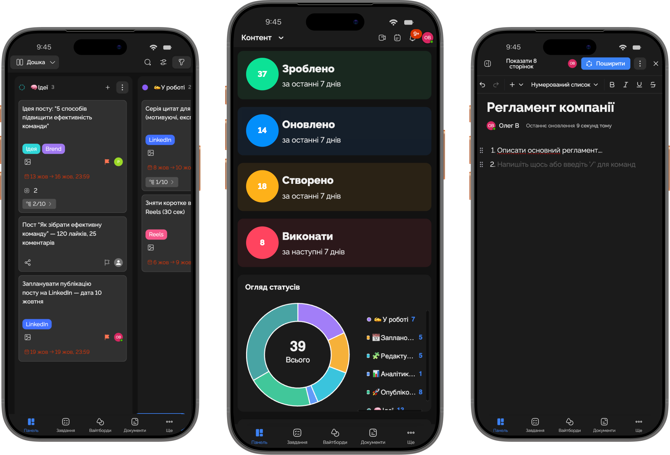
At the top — a "today" counter with a progress bar. Below it — three or four tasks most likely to be relevant in this moment (by due date, by the "today" tag, by "in progress" status). The rest of your projects live in a compact 6-tile grid, with no search and no filters. If you need more, the "all projects" button takes you to the full list, but that's a second screen, not the first.
The principle is simple: on a phone you show what changed since last time. New task assigned? Top of the list. Closed something? It disappears from the home screen. Nothing happened? The home screen is almost empty, and that's fine. This isn't a session for reviewing analytics; it's a session for action.
- Home screen = one question "what now", not "what exists".
- Up to 4 tasks in the list — more than that won't fit in one scroll on a 6" screen.
- Dashboards and deep analytics live one level down, behind a separate tab.
today
6 tasks
recent tasks
projects
Marketing
Product